You log in to Gmail. You can see you have about 17 new messages in your “Promotions” tab. You quickly skim through.

How could you not click on this promotional email from UrbanDaddy? At the very least you’ll look at it, and you probably won’t unsubscribe.
In some cases, you want to take your time to read through the entire email, but you just spent 20 minutes checking your Primary email section and responding to Facebook notifications. You want to see if your favorite businesses have sent you something worth reading, but in reality, you only have a couple of minutes to do so.
One of them has just released their new newsletter. You click to open it, and you see blank image placements and text where email graphics should be. You skim the text and forget to click on the “View images in email.” The newsletter doesn’t seem to make sense for that reason. Oh, and you just got a text from your friend, and where has the time gone? You close your computer, and you were never able to see the full newsletter.
Sound familiar? Even as business owners, we know that an onslaught of information has drowned our emails in a sea of notifications, sign-up lists, chat requests, and text messages. It seems hopeless to even invest in email design, right?
Changing the conversation about email graphics
Do some email clients block images? Yes they do. Does that mean we should forgo them? Consider this:
- People use smartphones to read emails more than ever. And they do it quickly. Visuals are read and understood 60,000x faster than text.
- According to Mailchimp, emails with two or more graphics get higher click-through rates.
Now, I could go on about the technical aspects of creating images and email graphics repositories, but I want to approach this article in a different manner. I want to change the conversation.
In the early days of direct mail, the best approach to getting the word out about things was to create thousands of copies of an ad and get it out to as many people as possible. This was a totally viable option, because back in the early days of industry, printing was cheap, and printing 500,000 copies of an advert expecting to get to at least 50,000 actual buying customers had a reasonable over/under margin for businesses.
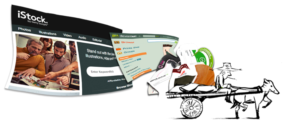
When costs went up, print runs went down, and response changed. It looked bleak. Then, bam! Here comes the Internet, and we now have the ability to distribute with even more reach for a fraction of the cost of print. One problem, though: All businesses can do the same things that you can. Now, in 2014, we’re competing with an avalanche of mediocrity that can only be dug out of by the sheer will of consumers to look past all of the junk to get to what you’re offering.
What art really has to do with your email
When considering art placement, understand that above and beyond text, there’s going to be an extra step involved for your consumers to view images in an email – at least the first time they receive one. Once they click “Always view images from YourBusiness.com,” they’ll see your images automatically from then on. My point is to approach all of this content the way that the Cellar Door has. Not in the product, per se, but in the methodology.
[Tweet “Subscribers were willing to sign up for emails directly from you. Reward them for this. Curate.”]Give your customers a reason to open the email and view the art. Make them feel special. This should come naturally, because they like you so much they were willing to subscribe to get things directly from you, not just from your website. Reward them for this with beautiful and content-rich emails.
If you’re going to include any imagery in said emailer, for the sake of all that is holy make sure your images fit in the following specifications:
-
72 dpi (for fast loading time)
-
“.jpeg” file format (fastest file type that retains the most quality)
-
No more that 600 pixels wide (the open width of most email programs)
-
Make sure the image can be fully seen at around 440 pixels tall (the viewer screen is only that tall in most email platforms)
Don’t understand what all of that means? It’s OK – your designer will. But it never hurts to learn for yourself.
When adding art to your emails, I like the way Tommy Walker at CrazyEgg (a/b testing software) explained it by saying, “more images communicates a greater attention to detail and respect for your subscriber’s time.”
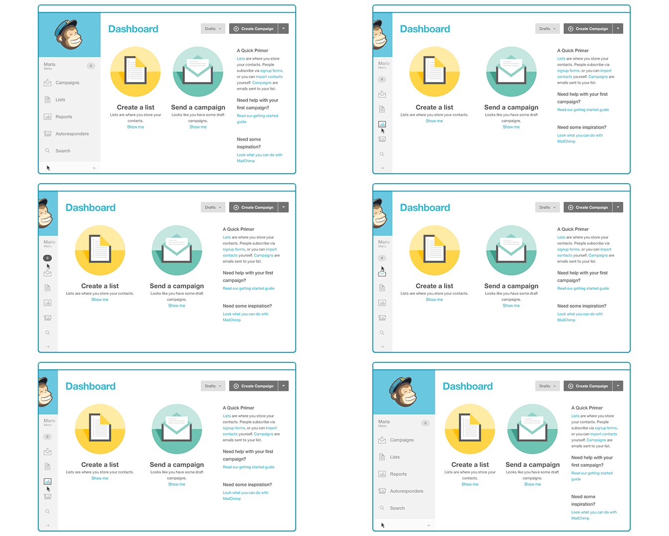
For example, MailChimp includes animated gifs in their emails to help their users better use their email marketing service. “They’ve reported this has reduced the amount of first-time-user customer service calls, and has allowed their users to start building email campaigns faster,” according to Walker.
It’s also the same reason why we illustrate our blog posts – so that they have an increased click rate in emails and social media. It’s why so many websites have changed their style to look more like Pinterest – people are attracted to images.
How to create email graphics that get clicks
At this point, you’re probably wondering what kind of graphics you can use that will increase your click-through rates, the rate at which people actually click on an image or link in your email. Here are the types of graphics that we find work best:
- Animated gifs, as above, that are helpful or convey a message without overwhelming the reader
- Beautiful illustrations related to your content that tell the readers you respect their time
- Photos of yourself or your business (photos of faces increase click rates tremendously)
- Photos or illustrations with the title of your article (or product) in it (think Pinterest-style)
Cellar Door, a pop-up restaurant that runs on donations from patrons, was created by husband-and-wife team Logan & Gary Mitchell. What’s brilliant about this approach is that the business structure itself demands a look into the email newsletter. “Our cellar door mailing list is currently 1,615, and grows about 3 to 6 a week,” Logan tells me. “We have between a 44% and 51% open rate.”
What is insanely genius about Cellar Door (besides the best 10-course meal in town for under $100) is the way that they operate. Once a month, they host a meal, and only about 10 people can RSVP for a spot. They rarely take reservations.
The only way to get a seat at their exclusive supper table is to keep an eye on your inbox for a newsletter showing you, as if you were in their restaurant, what’s on the menu for an upcoming meal.
If you don’t respond to the email in the first five to 10 minutes of receiving it, you probably won’t get a spot.
But your business is not all about secret supper clubs and newsletter RSVPs, right? Still, think of your newsletter as a very specific and important branch of your business, and an autonomous one at that.
How are you using graphics in your content marketing?

